Goals
- Solidify understanding of the six visualization principles introduced last class
- Know how to produce, interpret, and choose when to use several of the most commonly used types of data visualizations:
- Tables
- Dot and line plots
- Box and whisker plots
- Scatter plots
- Bar/column plots and (usually not) pie charts
- Histograms
import pandas as pd
import seaborn as sns
import matplotlib.pyplot as plt
Visualization Principles - Discussion
Some Datasets to Play With
penguins = sns.load_dataset("penguins")
fmri = sns.load_dataset("fmri")
mpg = sns.load_dataset("mpg")
penguins
fmri
fmri.sort_values(by=["subject", "timepoint"])
mpg
Matplotlib
colors = {"Adelie": "red", "Gentoo": "green", "Chinstrap": "blue"}
size = lambda x: 10 if x > 40 else 1
plt.scatter("body_mass_g", "flipper_length_mm", data=penguins,
            c=penguins["species"].map(colors),
            s=((penguins["bill_depth_mm"]/4)**2))
plt.legend()
plt.xlabel("Body Mass (g)")
plt.ylabel("Flipper Length (mm)");
Seaborn
sns.relplot(x="body_mass_g", y="flipper_length_mm",
            hue="species", size="bill_depth_mm", data=penguins)
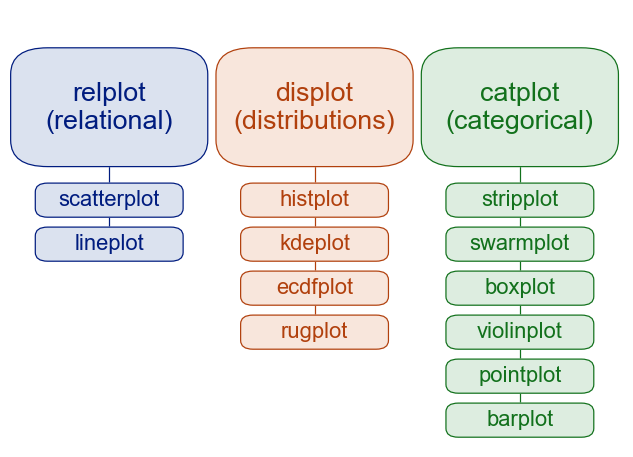
Key distinction: figure-level vs. axes-level:
https://seaborn.pydata.org/tutorial/function_overview.html
Common Data Visualizations
Tables
Suppose you want to see the 5 biggest penguins.
penguins.sort_values("body_mass_g", ascending=False).iloc[:5,:]
Table Tips:
- Think about row and column ordering
- Label columns and rows well (clear but concise).
- Uniform precision, right-justified numbers.
- Sometimes: bold or emphasize max or min values in a column
p = penguins.rename(columns={"species": "Species", "island": "Island",
                 "bill_length_mm": "Bill Length (mm)","bill_depth_mm": "Bill Depth (mm)",
                 "flipper_length_mm": "Flipper Length (mm)", "body_mass_g": "Body Mass (g)",
                 "sex": "Sex"})
p = p[["Species", "Island", "Sex", "Body Mass (g)", "Bill Length (mm)", "Bill Depth (mm)", "Flipper Length (mm)"]]
p.sort_values("Body Mass (g)", ascending=False).iloc[:5,:]
Dot plots, Line Plots
Conceptually (but not technically) different from a scatter plot, in that $x$ values are assumed to be ordered.
mpg
mpg_year = mpg.groupby("model_year")[["mpg"]].mean()
mpg_year
No connected dots - technically the same as a scatter plot.
sns.relplot(x="model_year", y="mpg", kind="scatter", data=mpg_year)
Connect the dots: now you have a line plot:
sns.relplot(x="model_year", y="mpg", kind="line", data=mpg_year)
Seaborn does sensible things if you have multiple datapoints per $x$ value:
sns.relplot(x="model_year", y="mpg", kind="line", data=mpg)
Exercise: when should you connect the dots?
Box and whisker plots
sns.boxplot(x="species", y="body_mass_g", data=penguins)
Exercise: Of the ones we've discussed so far (table, dot/line, box and whisker), which kind of visualization would you use to illustrate each of the following?
- The number of cars per model year in the MPG dataset
- The distribution of each penguin body measurement, independent of species.
- The centrality and variability of each penguin body measurement per species.
Scatter plots
sns.relplot(data=penguins, x="flipper_length_mm", y="bill_length_mm", hue="species")
Bar/column plots and (usually not) pie charts
sns.catplot(x="species", data=penguins, kind="count")
sns.catplot(x="species", data=penguins, kind="count", col="island")
sns.catplot(x="species", data=penguins, kind="count")
Histograms
sns.displot(penguins, x="flipper_length_mm")
sns.displot(penguins, x="flipper_length_mm", stat='density')
sns.displot(penguins, x="flipper_length_mm", col='species')
sns.displot(penguins, x="flipper_length_mm", hue="species", stat="density")
sns.displot(penguins, x="flipper_length_mm", hue="species", col="island")
sns.displot(penguins, x="flipper_length_mm", hue="species", col="island", kde='True')
sns.jointplot(x="bill_length_mm", y="bill_depth_mm", data=penguins, kind='hex')
fmri[fmri["subject"]=="s0"].sort_values(by="timepoint")
Exercise: Of the ones we've discussed so far (table, dot/line, box and whisker), which kind of visualization would you use to illustrate each of the following?
- Average signal per subject in the fmri dataset.
- The signal over time for each event type in patient 0, regardless of region.
- The distribution of bill lengths for Adelie penguins.
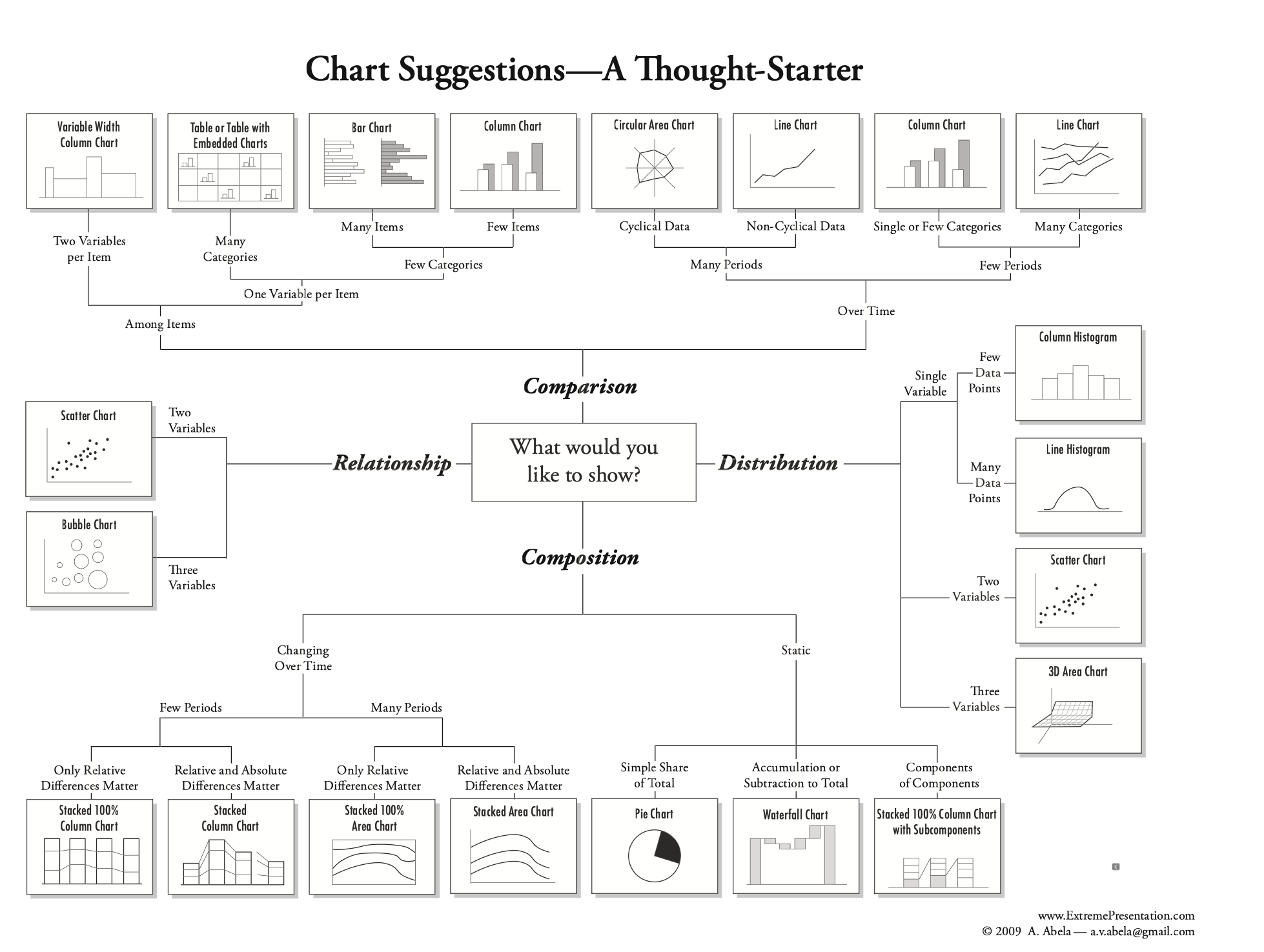
A helpful figure from the book:
Additional Practice: Download L06_exit.ipynb and add code to make one or more plots visualizing the response data.