Lecture 6 - Intro to Visualization: When and Why; Visualization Aesthetics
Announcements
import pandas as pd
import seaborn as sns
import matplotlib.pyplot as plt
Goals
- Understand the importance of visualization as a tool for understanding data.
- Know some of the different settings in which visualization is used.
- Understand some principles of how to make good visualizations
- Maximize data-ink ratio
- Minimize lie factor
- Minimize chartjunk
- Use scales and labeling well
- Use Color Well
- Use Repetition Well
Big Idea: Why visualize?
Consider Anscombe's Quartet:
import seaborn as sns
sns.set_theme(style="ticks")

# Load the example dataset for Anscombe's quartet
df = sns.load_dataset("anscombe")
# if you want to look at the raw data, this makes it into a nicer shape:
# df["idx"] = df.groupby("dataset").cumcount()
# df.pivot(index="idx", columns="dataset").swaplevel(0, 1, axis=1).sort_index(axis=1)
df.groupby("dataset").describe()
Hey, they're all the same! ...right? Let's confirm by visualizing:
# Show a scatter plot with a regression line for each dataset
sns.lmplot(x="x", y="y", col="dataset", hue="dataset", data=df,
           col_wrap=2, ci=None, palette="muted", height=4,
           scatter_kws={"s": 50, "alpha": 1})
Hmm, that didn't come out how I thought it would.
Takeaway: visualization is often the best (and sometimes the only) way to understand a dataset.
When should you visualize?
- When exploring data
- for me, this often looks like
df.plot.* - Goal: show you what's going on; answer questions for yourself.
- for me, this often looks like
- When presenting data
- for me, this often looks like
sns.*(...)along with a bunch of matplotlib code to fine-tune the appearance. - Goal: show your reader what's going on; tell a story about the data, clearly and faithfully.
- for me, this often looks like
- When providing interactive visualization tools for consumers of your data; examples:
What makes a good visualization?
Two concerns:
- Telling the truth
- Telling it clearly and with style
This is like asking what makes a good painting - it requires a sense of aesthetics.
Some principles to live by, based on the work of visualization pioneer Edward Tufte:
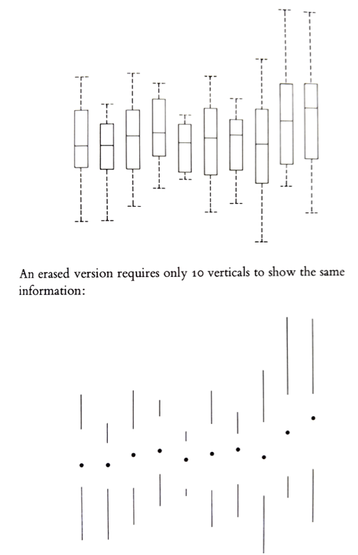
Maximize data-ink ratio
The data-ink ratio is the amount of "ink" used to represent data divided by the total amount of "ink" in the graphic:
$$ \frac{\textrm{ink used to represent data}}{\textrm{total ink in the graphic}}$$
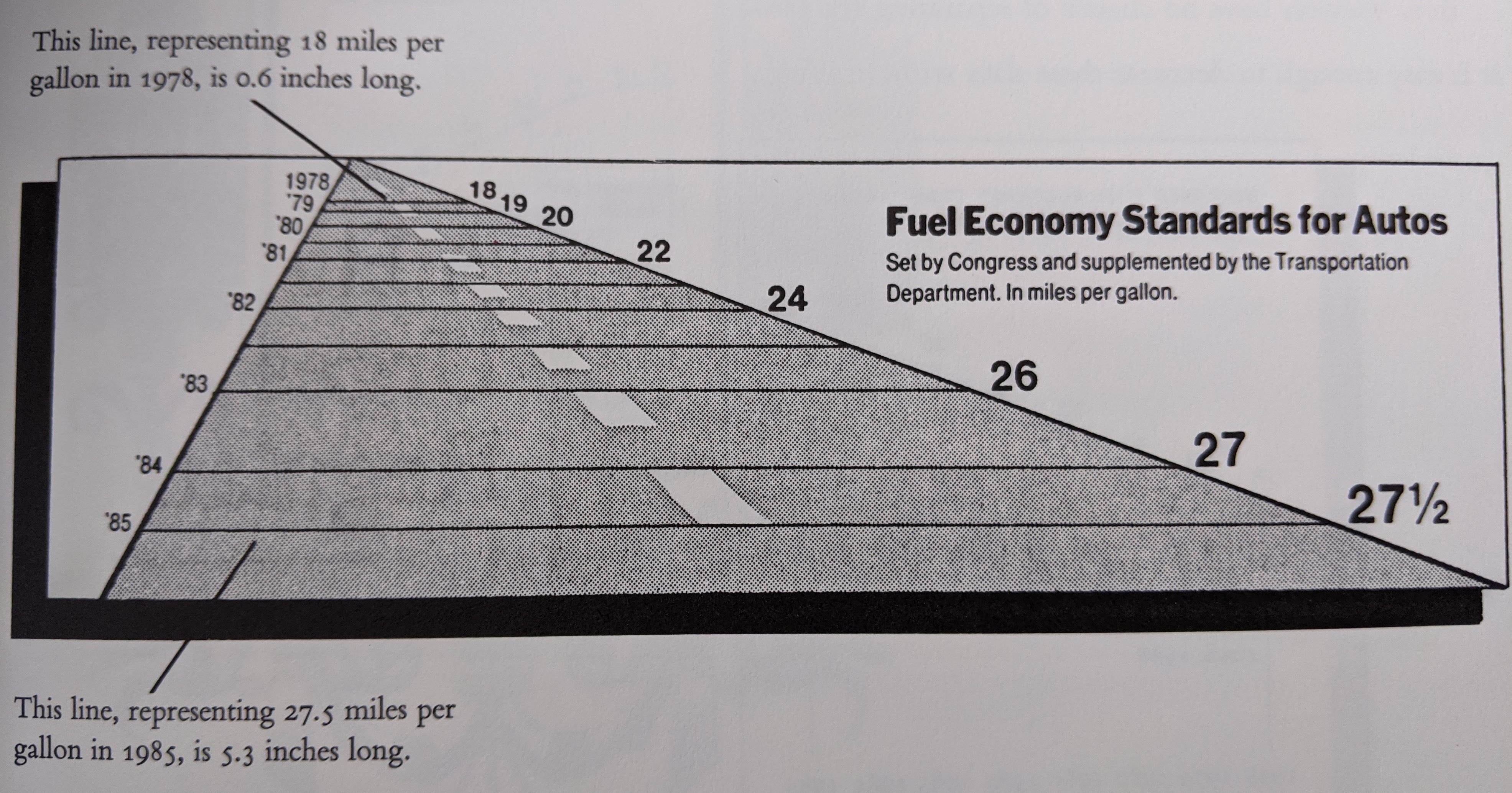
Minimize lie factor
The lie factor is the ratio between the size of the effect in your graphic and the size of the effect in the data:
$$ \frac{\textrm{size of effect in the graphic}}{\textrm{size of effect in the data}}$$
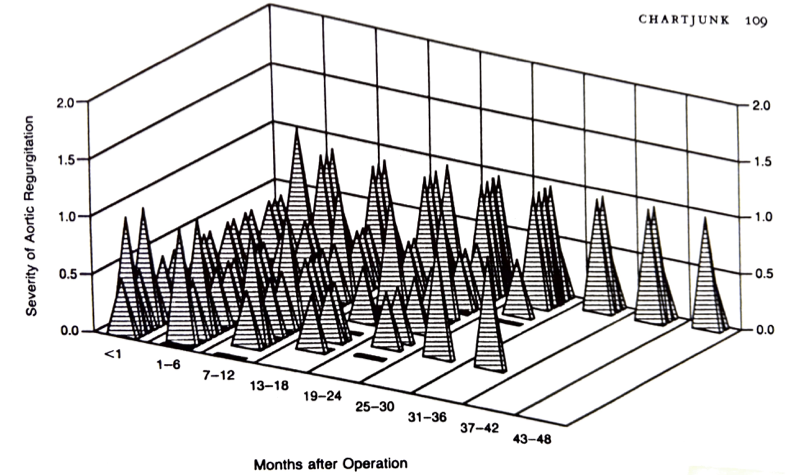
Minimize chartjunk
Chartjunk is loosely defined as extraneous visual elements that do not further the purpose of the graphic.
Use scales and labeling well
- Fill the available space with data (without increasing the lie factor)
- Use clear labels
Use color and shading well
- Colors can be used to differentiate categorical or numerical values.
- For numerical/continuous, use perceptually uniform colormaps.
- Avoid large areas of bright colors; small areas of sharp color contrast can be powerful visual elements.
Use repetition well
- Reuse the cognitive effort your reader puts in to understand one plot
- Small multiples - many small charts of the same thing, e.g., for different categories
- Example:
sns.pairplot
- Example:
- Multiple time series on a single set of axes
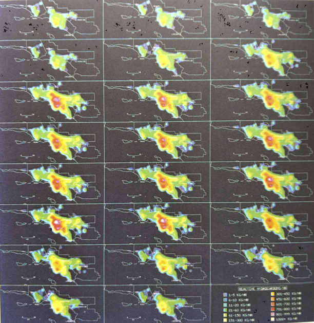
Activity: analyze a plot!
Write:
- Your plot number
- The names of your group members
- Analysis of the plot with respect to at least three of the above principles
- Maximize data-ink ratio
- Minimize lie factor
- Minimize chartjunk
- Use scales and labeling well
- Use Color Well
- Use Repetition Well
- Be prepared to share the most pertinent principle with the class in 1 minute or less.