Announcements
- None?
Goals
- Solidify understanding of the six visualization principles introduced last class
- Know how to produce, interpret, and choose when to use several of the most commonly used types of data visualizations:
- Tables
- Dot and line plots
- Box and whisker plots
- Scatter plots
- Bar/column plots and (usually not) pie charts
- Histograms
import pandas as pd
import seaborn as sns
import matplotlib.pyplot as plt
Exit Ticket Data
See L06_exit.ipynb
Lie Factor - Another Try

lie_factor = (5.3 - 0.6) / (27.5 - 18)
lie_factor
0.4947368421052632
Visualization Principles - Discussion
- Noisy; lots of text, could use fewer individual country labels
- Good use of color
- x axis grows exponentially
- cluttered
- don't record range band
- icky colors, muddle some of the data
- bad data-ink!
- scaling and labels - labels too large
- chartjiunk
- clutter
- a lot of information
- +color
- -data ink
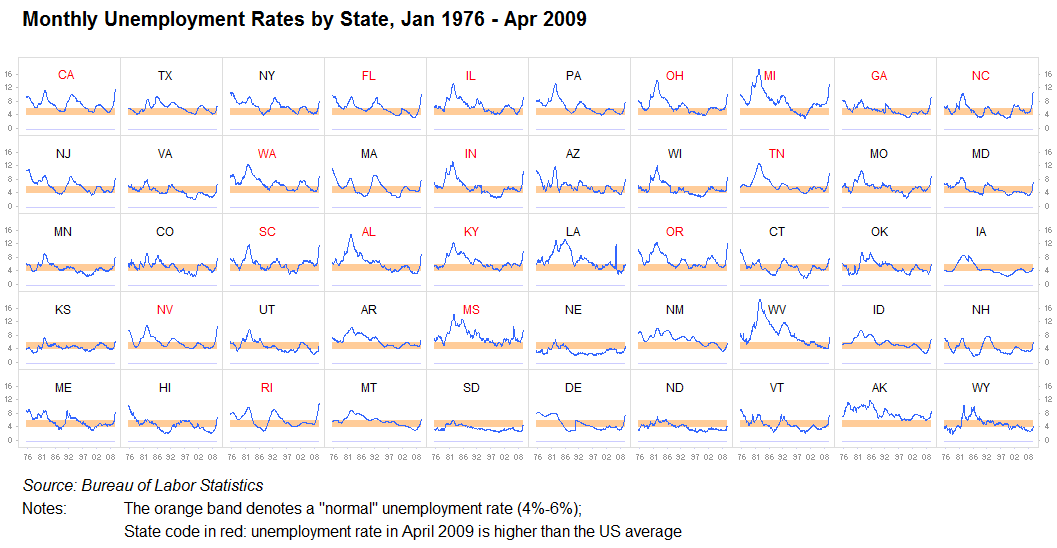
- +scaling
- +color
- +easy to compare along columns or rows
- -hard to compare distant states
- repetion
- -3D
- -color
- -both plots show the same thing
Some Datasets to Play With
penguins = sns.load_dataset("penguins")
fmri = sns.load_dataset("fmri")
mpg = sns.load_dataset("mpg")
penguins
| species | island | bill_length_mm | bill_depth_mm | flipper_length_mm | body_mass_g | sex | |
|---|---|---|---|---|---|---|---|
| 0 | Adelie | Torgersen | 39.1 | 18.7 | 181.0 | 3750.0 | Male |
| 1 | Adelie | Torgersen | 39.5 | 17.4 | 186.0 | 3800.0 | Female |
| 2 | Adelie | Torgersen | 40.3 | 18.0 | 195.0 | 3250.0 | Female |
| 3 | Adelie | Torgersen | NaN | NaN | NaN | NaN | NaN |
| 4 | Adelie | Torgersen | 36.7 | 19.3 | 193.0 | 3450.0 | Female |
| ... | ... | ... | ... | ... | ... | ... | ... |
| 339 | Gentoo | Biscoe | NaN | NaN | NaN | NaN | NaN |
| 340 | Gentoo | Biscoe | 46.8 | 14.3 | 215.0 | 4850.0 | Female |
| 341 | Gentoo | Biscoe | 50.4 | 15.7 | 222.0 | 5750.0 | Male |
| 342 | Gentoo | Biscoe | 45.2 | 14.8 | 212.0 | 5200.0 | Female |
| 343 | Gentoo | Biscoe | 49.9 | 16.1 | 213.0 | 5400.0 | Male |
344 rows × 7 columns
fmri
| subject | timepoint | event | region | signal | |
|---|---|---|---|---|---|
| 0 | s13 | 18 | stim | parietal | -0.017552 |
| 1 | s5 | 14 | stim | parietal | -0.080883 |
| 2 | s12 | 18 | stim | parietal | -0.081033 |
| 3 | s11 | 18 | stim | parietal | -0.046134 |
| 4 | s10 | 18 | stim | parietal | -0.037970 |
| ... | ... | ... | ... | ... | ... |
| 1059 | s0 | 8 | cue | frontal | 0.018165 |
| 1060 | s13 | 7 | cue | frontal | -0.029130 |
| 1061 | s12 | 7 | cue | frontal | -0.004939 |
| 1062 | s11 | 7 | cue | frontal | -0.025367 |
| 1063 | s0 | 0 | cue | parietal | -0.006899 |
1064 rows × 5 columns
fmri.sort_values(by=["subject", "timepoint"])
| subject | timepoint | event | region | signal | |
|---|---|---|---|---|---|
| 67 | s0 | 0 | stim | frontal | -0.021452 |
| 521 | s0 | 0 | stim | parietal | -0.039327 |
| 932 | s0 | 0 | cue | frontal | 0.007766 |
| 1063 | s0 | 0 | cue | parietal | -0.006899 |
| 251 | s0 | 1 | stim | parietal | -0.035735 |
| ... | ... | ... | ... | ... | ... |
| 817 | s9 | 17 | cue | parietal | -0.036362 |
| 5 | s9 | 18 | stim | parietal | -0.103513 |
| 519 | s9 | 18 | stim | frontal | -0.009959 |
| 722 | s9 | 18 | cue | frontal | -0.000643 |
| 803 | s9 | 18 | cue | parietal | -0.051040 |
1064 rows × 5 columns
mpg
| mpg | cylinders | displacement | horsepower | weight | acceleration | model_year | origin | name | |
|---|---|---|---|---|---|---|---|---|---|
| 0 | 18.0 | 8 | 307.0 | 130.0 | 3504 | 12.0 | 70 | usa | chevrolet chevelle malibu |
| 1 | 15.0 | 8 | 350.0 | 165.0 | 3693 | 11.5 | 70 | usa | buick skylark 320 |
| 2 | 18.0 | 8 | 318.0 | 150.0 | 3436 | 11.0 | 70 | usa | plymouth satellite |
| 3 | 16.0 | 8 | 304.0 | 150.0 | 3433 | 12.0 | 70 | usa | amc rebel sst |
| 4 | 17.0 | 8 | 302.0 | 140.0 | 3449 | 10.5 | 70 | usa | ford torino |
| ... | ... | ... | ... | ... | ... | ... | ... | ... | ... |
| 393 | 27.0 | 4 | 140.0 | 86.0 | 2790 | 15.6 | 82 | usa | ford mustang gl |
| 394 | 44.0 | 4 | 97.0 | 52.0 | 2130 | 24.6 | 82 | europe | vw pickup |
| 395 | 32.0 | 4 | 135.0 | 84.0 | 2295 | 11.6 | 82 | usa | dodge rampage |
| 396 | 28.0 | 4 | 120.0 | 79.0 | 2625 | 18.6 | 82 | usa | ford ranger |
| 397 | 31.0 | 4 | 119.0 | 82.0 | 2720 | 19.4 | 82 | usa | chevy s-10 |
398 rows × 9 columns
Matplotlib
colors = {"Adelie": "red", "Gentoo": "green", "Chinstrap": "blue"}
size = lambda x: 10 if x > 40 else 1
plt.scatter("body_mass_g", "flipper_length_mm", data=penguins,
            c=penguins["species"].map(colors),
            s=((penguins["bill_depth_mm"]/4)**2))
plt.legend()
plt.xlabel("Body Mass (g)")
plt.ylabel("Flipper Length (mm)")
Text(0, 0.5, 'Flipper Length (mm)')

Seaborn
sns.relplot(x="body_mass_g", y="flipper_length_mm",
            hue="species", size="bill_depth_mm", data=penguins)
<seaborn.axisgrid.FacetGrid at 0x14d846ff2480>

Key distinction: figure-level vs. axes-level:
https://seaborn.pydata.org/tutorial/function_overview.html
Common Data Visualizations
Tables
Suppose you want to see the 5 biggest penguins.
penguins.sort_values("body_mass_g", ascending=False).iloc[:5,:]
| species | island | bill_length_mm | bill_depth_mm | flipper_length_mm | body_mass_g | sex | |
|---|---|---|---|---|---|---|---|
| 237 | Gentoo | Biscoe | 49.2 | 15.2 | 221.0 | 6300.0 | Male |
| 253 | Gentoo | Biscoe | 59.6 | 17.0 | 230.0 | 6050.0 | Male |
| 337 | Gentoo | Biscoe | 48.8 | 16.2 | 222.0 | 6000.0 | Male |
| 297 | Gentoo | Biscoe | 51.1 | 16.3 | 220.0 | 6000.0 | Male |
| 331 | Gentoo | Biscoe | 49.8 | 15.9 | 229.0 | 5950.0 | Male |
Table Tips:
- Think about row and column ordering
- Label columns and rows well (clear but concise).
- Uniform precision, right-justified numbers.
- Sometimes: bold or emphasize max or min values in a column
p = penguins.rename(columns={"species": "Species", "island": "Island",
                 "bill_length_mm": "Bill Length (mm)","bill_depth_mm": "Bill Depth (mm)",
                 "flipper_length_mm": "Flipper Length (mm)", "body_mass_g": "Body Mass (g)",
                 "sex": "Sex"})
p = p[["Species", "Island", "Sex", "Body Mass (g)", "Bill Length (mm)", "Bill Depth (mm)", "Flipper Length (mm)"]]
p.sort_values("Body Mass (g)", ascending=False).iloc[:5,:]
| Species | Island | Sex | Body Mass (g) | Bill Length (mm) | Bill Depth (mm) | Flipper Length (mm) | |
|---|---|---|---|---|---|---|---|
| 237 | Gentoo | Biscoe | Male | 6300.0 | 49.2 | 15.2 | 221.0 |
| 253 | Gentoo | Biscoe | Male | 6050.0 | 59.6 | 17.0 | 230.0 |
| 337 | Gentoo | Biscoe | Male | 6000.0 | 48.8 | 16.2 | 222.0 |
| 297 | Gentoo | Biscoe | Male | 6000.0 | 51.1 | 16.3 | 220.0 |
| 331 | Gentoo | Biscoe | Male | 5950.0 | 49.8 | 15.9 | 229.0 |
Dot plots, Line Plots
Conceptually (but not technically) different from a scatter plot, in that $x$ values are assumed to be ordered.
mpg
| mpg | cylinders | displacement | horsepower | weight | acceleration | model_year | origin | name | |
|---|---|---|---|---|---|---|---|---|---|
| 0 | 18.0 | 8 | 307.0 | 130.0 | 3504 | 12.0 | 70 | usa | chevrolet chevelle malibu |
| 1 | 15.0 | 8 | 350.0 | 165.0 | 3693 | 11.5 | 70 | usa | buick skylark 320 |
| 2 | 18.0 | 8 | 318.0 | 150.0 | 3436 | 11.0 | 70 | usa | plymouth satellite |
| 3 | 16.0 | 8 | 304.0 | 150.0 | 3433 | 12.0 | 70 | usa | amc rebel sst |
| 4 | 17.0 | 8 | 302.0 | 140.0 | 3449 | 10.5 | 70 | usa | ford torino |
| ... | ... | ... | ... | ... | ... | ... | ... | ... | ... |
| 393 | 27.0 | 4 | 140.0 | 86.0 | 2790 | 15.6 | 82 | usa | ford mustang gl |
| 394 | 44.0 | 4 | 97.0 | 52.0 | 2130 | 24.6 | 82 | europe | vw pickup |
| 395 | 32.0 | 4 | 135.0 | 84.0 | 2295 | 11.6 | 82 | usa | dodge rampage |
| 396 | 28.0 | 4 | 120.0 | 79.0 | 2625 | 18.6 | 82 | usa | ford ranger |
| 397 | 31.0 | 4 | 119.0 | 82.0 | 2720 | 19.4 | 82 | usa | chevy s-10 |
398 rows × 9 columns
mpg_year = mpg.groupby("model_year")[["mpg"]].mean()
mpg_year
| mpg | |
|---|---|
| model_year | |
| 70 | 17.689655 |
| 71 | 21.250000 |
| 72 | 18.714286 |
| 73 | 17.100000 |
| 74 | 22.703704 |
| 75 | 20.266667 |
| 76 | 21.573529 |
| 77 | 23.375000 |
| 78 | 24.061111 |
| 79 | 25.093103 |
| 80 | 33.696552 |
| 81 | 30.334483 |
| 82 | 31.709677 |
No connected dots - technically the same as a scatter plot.
sns.relplot(x="model_year", y="mpg", kind="scatter", data=mpg_year)
<seaborn.axisgrid.FacetGrid at 0x14d83f418230>

Connect the dots: now you have a line plot:
sns.relplot(x="model_year", y="mpg", kind="line", data=mpg_year)
<seaborn.axisgrid.FacetGrid at 0x14d8471a2930>

Seaborn does sensible things if you have multiple datapoints per $x$ value:
sns.relplot(x="model_year", y="mpg", kind="line", data=mpg)
<seaborn.axisgrid.FacetGrid at 0x14d83f2b75c0>

Quandry: when should you connect the dots?
Box and whisker plots
sns.boxplot(x="species", y="body_mass_g", data=penguins)
<Axes: xlabel='species', ylabel='body_mass_g'>

Think Pair Share: Of the ones we've discussed so far (table, dot/line, box and whisker), which kind of visualization would you use to illustrate each of the following?
- The number of cars per model year in the MPG dataset
- The distribution of each penguin body measurement, independent of species.
- The centrality and variability of each penguin body measurement per species.
Scatter plots
sns.relplot(data=penguins, x="flipper_length_mm", y="bill_length_mm", hue="species")
<seaborn.axisgrid.FacetGrid at 0x14d8455575c0>

Bar/column plots and (usually not) pie charts
sns.catplot(x="species", data=penguins, kind="count")
<seaborn.axisgrid.FacetGrid at 0x14d8455680e0>

sns.catplot(x="species", data=penguins, kind="count", col="island")
<seaborn.axisgrid.FacetGrid at 0x14d84533aab0>

sns.catplot(x="species", data=penguins, kind="count")
<seaborn.axisgrid.FacetGrid at 0x14d8440b72c0>
Histograms
sns.displot(penguins, x="flipper_length_mm")
<seaborn.axisgrid.FacetGrid at 0x14d84533a6f0>

sns.displot(penguins, x="flipper_length_mm", stat='density')
<seaborn.axisgrid.FacetGrid at 0x14d845d1d130>

sns.displot(penguins, x="flipper_length_mm", col='species')
<seaborn.axisgrid.FacetGrid at 0x14d8441ab0b0>

sns.displot(penguins, x="flipper_length_mm", hue="species", stat="density")
<seaborn.axisgrid.FacetGrid at 0x14d83fcfd130>

sns.displot(penguins, x="flipper_length_mm", hue="species", col="island")
<seaborn.axisgrid.FacetGrid at 0x14d8441a9040>

sns.displot(penguins, x="flipper_length_mm", hue="species", col="island", kde='True')
<seaborn.axisgrid.FacetGrid at 0x14d83fcfec60>

sns.jointplot(x="bill_length_mm", y="bill_depth_mm", data=penguins, kind='hex')
<seaborn.axisgrid.JointGrid at 0x14d84556cfb0>

fmri[fmri["subject"]=="s0"].sort_values(by="timepoint")
| subject | timepoint | event | region | signal | |
|---|---|---|---|---|---|
| 67 | s0 | 0 | stim | frontal | -0.021452 |
| 521 | s0 | 0 | stim | parietal | -0.039327 |
| 1063 | s0 | 0 | cue | parietal | -0.006899 |
| 932 | s0 | 0 | cue | frontal | 0.007766 |
| 675 | s0 | 1 | cue | parietal | 0.000300 |
| ... | ... | ... | ... | ... | ... |
| 783 | s0 | 17 | cue | frontal | -0.010375 |
| 812 | s0 | 18 | cue | parietal | -0.014664 |
| 721 | s0 | 18 | cue | frontal | -0.003497 |
| 515 | s0 | 18 | stim | frontal | -0.048430 |
| 14 | s0 | 18 | stim | parietal | -0.075570 |
76 rows × 5 columns
Think Pair Share: Of the ones we've discussed so far (table, dot/line, box and whisker), which kind of visualization would you use to illustrate each of the following?
- Average signal per subject in the fmri dataset.
- The signal over time for each event type in patient 0, regardless of region.
- The distribution of bill lengths for Adelie penguins.
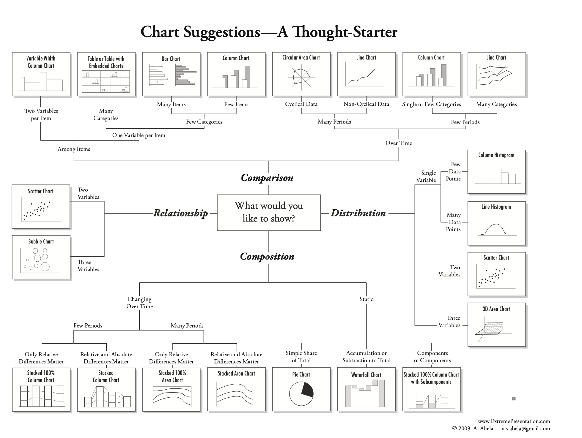
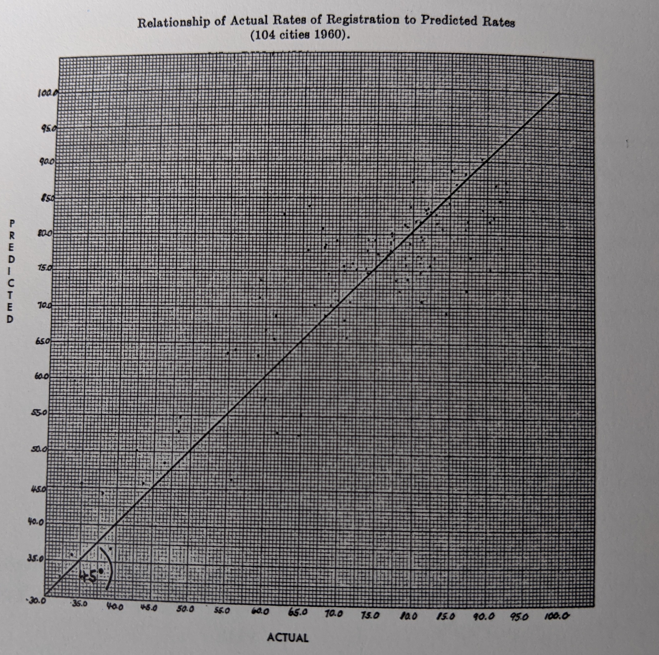
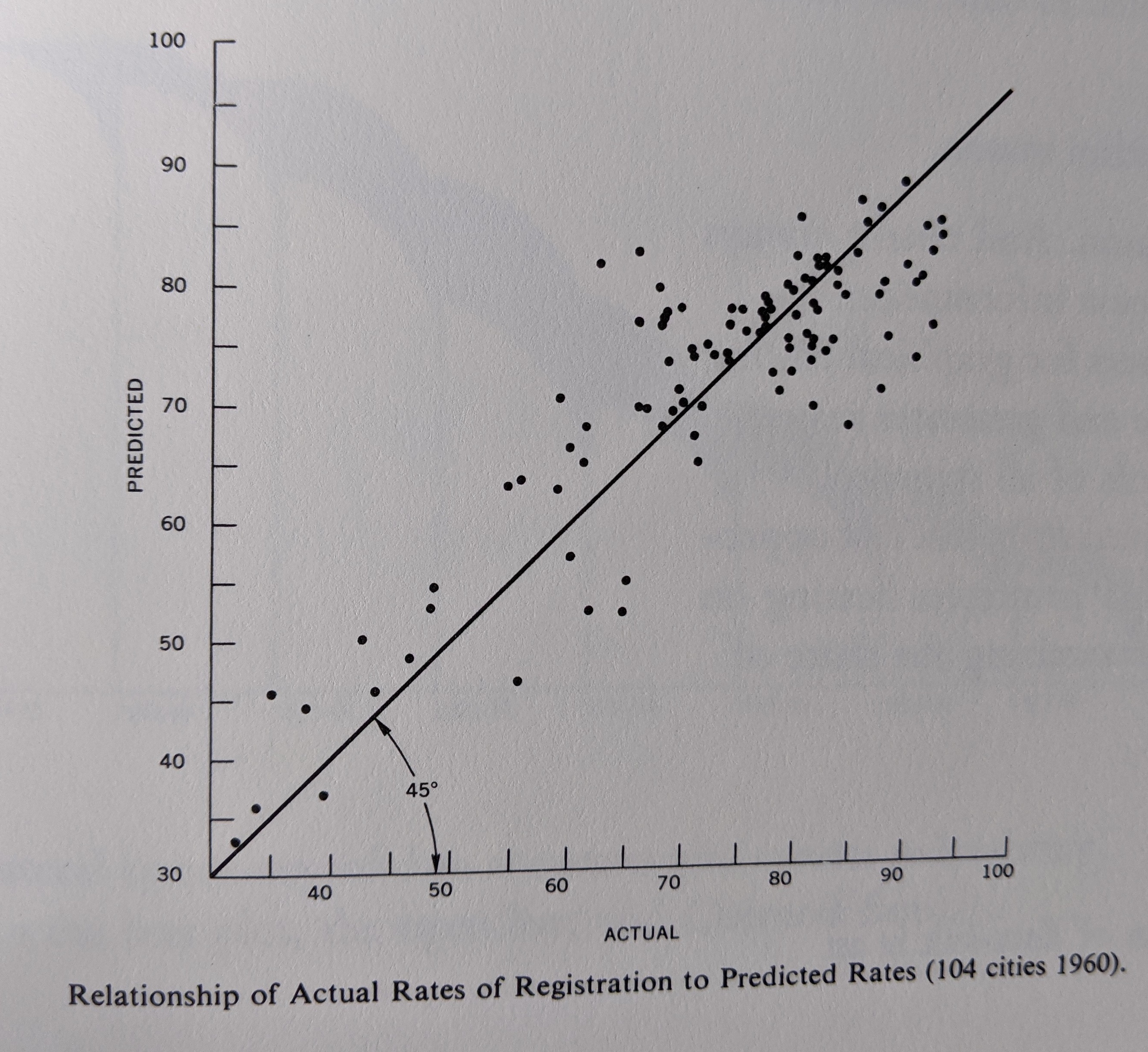
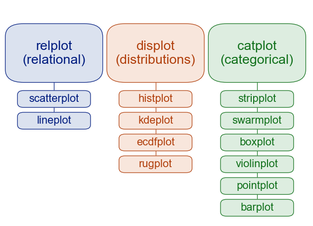
A helpful figure from the book: