Lecture 6 - Intro to Visualization: When and Why; Visualization Aesthetics
Announcements
Thursday office hours have changed slightly: now 11:00-11:30 and 12:00-12:30.
- Sorry if you showed up between 10:30 and 11 yesterday and I wasn't there =(
Quiz 1 grades were released on gradescope - were you able to log in and see them?
- I generally transfer grades to Canvas about a week after I release on Gradescope
import pandas as pd
import seaborn as sns
import matplotlib.pyplot as plt
Goals
- Understand the importance of visualization as a tool for understanding data.
- Know some of the different settings in which visualization is used.
- Understand some principles of how to make good visualizations
- Maximize data-ink ratio
- Minimize lie factor
- Minimize chartjunk
- Use scales and labeling well
- Use Color Well
- Use Repetition Well
Big Idea: Why visualize?
Consider Anscombe's Quartet:
import seaborn as sns
sns.set_theme(style="ticks")

# Load the example dataset for Anscombe's quartet
df = sns.load_dataset("anscombe")
df
| dataset | x | y | |
|---|---|---|---|
| 0 | I | 10.0 | 8.04 |
| 1 | I | 8.0 | 6.95 |
| 2 | I | 13.0 | 7.58 |
| 3 | I | 9.0 | 8.81 |
| 4 | I | 11.0 | 8.33 |
| 5 | I | 14.0 | 9.96 |
| 6 | I | 6.0 | 7.24 |
| 7 | I | 4.0 | 4.26 |
| 8 | I | 12.0 | 10.84 |
| 9 | I | 7.0 | 4.82 |
| 10 | I | 5.0 | 5.68 |
| 11 | II | 10.0 | 9.14 |
| 12 | II | 8.0 | 8.14 |
| 13 | II | 13.0 | 8.74 |
| 14 | II | 9.0 | 8.77 |
| 15 | II | 11.0 | 9.26 |
| 16 | II | 14.0 | 8.10 |
| 17 | II | 6.0 | 6.13 |
| 18 | II | 4.0 | 3.10 |
| 19 | II | 12.0 | 9.13 |
| 20 | II | 7.0 | 7.26 |
| 21 | II | 5.0 | 4.74 |
| 22 | III | 10.0 | 7.46 |
| 23 | III | 8.0 | 6.77 |
| 24 | III | 13.0 | 12.74 |
| 25 | III | 9.0 | 7.11 |
| 26 | III | 11.0 | 7.81 |
| 27 | III | 14.0 | 8.84 |
| 28 | III | 6.0 | 6.08 |
| 29 | III | 4.0 | 5.39 |
| 30 | III | 12.0 | 8.15 |
| 31 | III | 7.0 | 6.42 |
| 32 | III | 5.0 | 5.73 |
| 33 | IV | 8.0 | 6.58 |
| 34 | IV | 8.0 | 5.76 |
| 35 | IV | 8.0 | 7.71 |
| 36 | IV | 8.0 | 8.84 |
| 37 | IV | 8.0 | 8.47 |
| 38 | IV | 8.0 | 7.04 |
| 39 | IV | 8.0 | 5.25 |
| 40 | IV | 19.0 | 12.50 |
| 41 | IV | 8.0 | 5.56 |
| 42 | IV | 8.0 | 7.91 |
| 43 | IV | 8.0 | 6.89 |
df.groupby("dataset").describe()
| x | y | |||||||||||||||
|---|---|---|---|---|---|---|---|---|---|---|---|---|---|---|---|---|
| count | mean | std | min | 25% | 50% | 75% | max | count | mean | std | min | 25% | 50% | 75% | max | |
| dataset | ||||||||||||||||
| I | 11.0 | 9.0 | 3.316625 | 4.0 | 6.5 | 9.0 | 11.5 | 14.0 | 11.0 | 7.500909 | 2.031568 | 4.26 | 6.315 | 7.58 | 8.57 | 10.84 |
| II | 11.0 | 9.0 | 3.316625 | 4.0 | 6.5 | 9.0 | 11.5 | 14.0 | 11.0 | 7.500909 | 2.031657 | 3.10 | 6.695 | 8.14 | 8.95 | 9.26 |
| III | 11.0 | 9.0 | 3.316625 | 4.0 | 6.5 | 9.0 | 11.5 | 14.0 | 11.0 | 7.500000 | 2.030424 | 5.39 | 6.250 | 7.11 | 7.98 | 12.74 |
| IV | 11.0 | 9.0 | 3.316625 | 8.0 | 8.0 | 8.0 | 8.0 | 19.0 | 11.0 | 7.500909 | 2.030579 | 5.25 | 6.170 | 7.04 | 8.19 | 12.50 |
Hey, they're all the same! ...right? Let's confirm by visualizing:
# Show a scatter plot with a regression line for each dataset
sns.lmplot(x="x", y="y", col="dataset", hue="dataset", data=df,
           col_wrap=2, ci=None, palette="muted", height=4,
           scatter_kws={"s": 50, "alpha": 1})
<seaborn.axisgrid.FacetGrid at 0x147f03c6df10>

Hmm, that didn't come out how I thought it would.
Takeaway: visualization is often the best (and sometimes the only) way to understand a dataset.
When should you visualize?
- When exploring data
- for me, this often looks like
df.plot.* - Goal: show you what's going on; answer questions for yourself.
- for me, this often looks like
- When presenting data
- for me, this often looks like
sns.*(...)along with a bunch of matplotlib code to fine-tune the appearance. - Goal: show your reader what's going on; tell a story about the data, clearly and faithfully.
- for me, this often looks like
- When providing interactive visualization tools for consumers of your data; examples:
What makes a good visualization?
This is like asking what makes a good painting - it requires a sense of aesthetics.
Some principles to live by, based on the work of visualization pioneer Edward Tufte:
Maximize data-ink ratio
The data-ink ratio is the amount of "ink" used to represent data divided by the total amount of "ink" in the graphic:
$$ \frac{\textrm{ink used to represent data}}{\textrm{total ink in the graphic}}$$

Minimize lie factor
The lie factor is the ratio between the size of the effect in your graphic and the size of the effect in the data:
$$ \frac{\textrm{size of effect in the graphic}}{\textrm{size of effect in the data}}$$
Minimize chartjunk
Chartjunk is loosely defined as extraneous visual elements that do not further the purpose of the graphic.

Use scales and labeling well
- Fill the available space with data (without increasing the lie factor)
- Use clear labels
Use color and shading well
- Colors can be used to differentiate categorical or numerical values.
- For numerical/continuous, use perceptually uniform colormaps.
- Avoid large areas of bright colors; small areas of sharp color contrast can be powerful visual elements.

Use repetition well
- Reuse the cognitive effort your reader puts in to understand one plot
- Small multiples - many small charts of the same thing, e.g., for different categories
- Example:
sns.pairplot
- Example:
- Multiple time series on a single set of axes

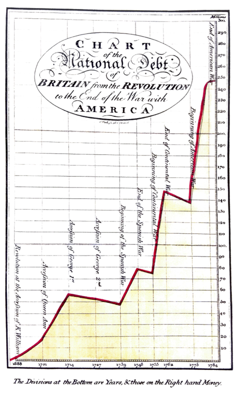
Activity: analyze a plot!
Write:
- Your plot number
- The names of your group members
- Analysis of the plot with respect to at least three of the above principles
- Maximize data-ink ratio
- Minimize lie factor
- Minimize chartjunk
- Use scales and labeling well
- Use Color Well
- Use Repetition Well
- Be prepared to share the most pertinent principle with the class in 1 minute or less.