Lecture 6 - Intro to Visualization: When and Why; Visualization Aesthetics

Announcements

Talks:

  • 1/23 Fuqun Huang 4pm CF 105 - Research (human errors in software engineering)
  • 1/24 Fuqun Huang 4pm CF 025 - Teaching

Lab 1 Survey thoughts

In [ ]:
import pandas as pd
import seaborn as sns
import matplotlib.pyplot as plt

Goals

  • Understand the importance of visualization as a tool for understanding data.
  • Know some of the different settings in which visualization is used.
  • Understand some principles of how to make good visualizations
    • Maximize data-ink ratio
    • Minimize lie factor
    • Minimize chartjunk
    • Use scales and labeling well
    • Use Color Well
    • Use Repetition Well

Big Idea: Why visualize?

Consider Anscombe's Quartet:

In [1]:
import seaborn as sns
sns.set_theme(style="ticks")

# Load the example dataset for Anscombe's quartet
df = sns.load_dataset("anscombe")
df
Out[1]:
dataset x y
0 I 10.0 8.04
1 I 8.0 6.95
2 I 13.0 7.58
3 I 9.0 8.81
4 I 11.0 8.33
5 I 14.0 9.96
6 I 6.0 7.24
7 I 4.0 4.26
8 I 12.0 10.84
9 I 7.0 4.82
10 I 5.0 5.68
11 II 10.0 9.14
12 II 8.0 8.14
13 II 13.0 8.74
14 II 9.0 8.77
15 II 11.0 9.26
16 II 14.0 8.10
17 II 6.0 6.13
18 II 4.0 3.10
19 II 12.0 9.13
20 II 7.0 7.26
21 II 5.0 4.74
22 III 10.0 7.46
23 III 8.0 6.77
24 III 13.0 12.74
25 III 9.0 7.11
26 III 11.0 7.81
27 III 14.0 8.84
28 III 6.0 6.08
29 III 4.0 5.39
30 III 12.0 8.15
31 III 7.0 6.42
32 III 5.0 5.73
33 IV 8.0 6.58
34 IV 8.0 5.76
35 IV 8.0 7.71
36 IV 8.0 8.84
37 IV 8.0 8.47
38 IV 8.0 7.04
39 IV 8.0 5.25
40 IV 19.0 12.50
41 IV 8.0 5.56
42 IV 8.0 7.91
43 IV 8.0 6.89
In [2]:
df.groupby("dataset").describe()
Out[2]:
x y
count mean std min 25% 50% 75% max count mean std min 25% 50% 75% max
dataset
I 11.0 9.0 3.316625 4.0 6.5 9.0 11.5 14.0 11.0 7.500909 2.031568 4.26 6.315 7.58 8.57 10.84
II 11.0 9.0 3.316625 4.0 6.5 9.0 11.5 14.0 11.0 7.500909 2.031657 3.10 6.695 8.14 8.95 9.26
III 11.0 9.0 3.316625 4.0 6.5 9.0 11.5 14.0 11.0 7.500000 2.030424 5.39 6.250 7.11 7.98 12.74
IV 11.0 9.0 3.316625 8.0 8.0 8.0 8.0 19.0 11.0 7.500909 2.030579 5.25 6.170 7.04 8.19 12.50

Hey, they're all the same! ...right? Let's confirm by visualizing:

In [3]:
# Show a scatter plot with a regression line for each dataset
sns.lmplot(x="x", y="y", col="dataset", hue="dataset", data=df,
           col_wrap=2, ci=None, palette="muted", height=4,
           scatter_kws={"s": 50, "alpha": 1})
Out[3]:
<seaborn.axisgrid.FacetGrid at 0x7f0e11cd1ca0>

Hmm, that didn't come out how I thought it would.

Takeaway: visualization is often the best (and sometimes the only) way to understand a dataset.

When should you visualize?

  • When exploring data
    • for me, this often looks like df.plot.*
    • Goal: show you what's going on; answer questions for yourself.
  • When presenting data
    • for me, this often looks like sns.*(...) along with a bunch of matplotlib code to fine-tune the appearance.
    • Goal: show your reader what's going on; tell a story about the data, clearly and faithfully.
  • When providing interactive visualization tools for consumers of your data; examples:
    • https://www.mountwashington.org/experience-the-weather/current-summit-conditions.aspx
    • https://pudding.cool/projects/vocabulary/

What makes a good visualization?

This is like asking what makes a good painting - it requires a sense of aesthetics.

Some principles to live by, based on the work of visualization pioneer Edward Tufte:

Maximize data-ink ratio

The data-ink ratio is the amount of "ink" used to represent data divided by the total amount of "ink" in the graphic:

$$ \frac{\textrm{ink used to represent data}}{\textrm{total ink in the graphic}}$$

Minimize lie factor

The lie factor is the ratio between the size of the effect in your graphic and the size of the effect in the data:

$$ \frac{\textrm{size of effect in the graphic}}{\textrm{size of effect in the data}}$$

Minimize chartjunk

Chartjunk is loosely defined as extraneous visual elements that do not further the purpose of the graphic.

Use scales and labeling well

  • Fill the available space with data (without increasing the lie factor)
  • Use clear labels

Use color and shading well

  • Colors can be used to differentiate categorical or numerical values.
  • For numerical/continuous, use perceptually uniform colormaps.
  • Avoid large areas of bright colors; small areas of sharp color contrast can be powerful visual elements.

Use repetition well

  • Reuse the cognitive effort your reader puts in to understand one plot
  • Small multiples - many small charts of the same thing, e.g., for different categories
    • Example: sns.pairplot
  • Multiple time series on a single set of axes

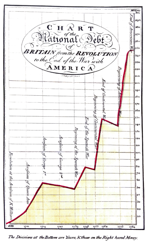
Activity: analyze a plot!

Write:

  • Your plot number
  • The names of your group members
  • Analysis of the plot with respect to at least three of the above principles
    • Maximize data-ink ratio
    • Minimize lie factor
    • Minimize chartjunk
    • Use scales and labeling well
    • Use Color Well
    • Use Repetition Well
  • Be prepared to share the most pertinent principle with the class in 1 minute or less.